Meaning of Logo
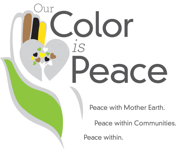
Our Color is Peace’s logo reflects our purpose: unity, equality, respect, and peace. Our logo is a metaphor - the fingers of the hand have different shapes, sizes, and functions, but only when they support and complement one another can the hand fulfill its duties. The colors of the fingers symbolize different ethnicities: brown, white, black, and yellow. Green, which is the color of nature, represents the planet in which we all live. The focal point is that the hand is holding a heart, and its correct functioning depends on the harmony of the fingers to sustain it. If one of the fingers is wounded, then the whole hand suffers causing the unbalance of the heart they are sustaining.
Metaphorically speaking, no finger can be more important or better than other because we are all interconnected. Only through harmony between the planet and its habitants, is possible to develop societies where peace, unity, care, love, and compassion lead toward true sustainability. Our goal as an organization is to contribute to the healing of the planet by supporting life in all its manifestations, protecting the ecosystems, and promoting individual peace and within communities.

![our_color_is_peace_tagline[1]-02 our_color_is_peace_tagline[1]-02](https://ocipeace.org/wp-content/uploads/2019/02/our_color_is_peace_tagline1-02.png)